

October 3-7 | Starting at $500Sense Toothpaste: Brand & Packaging System
Project Overview—Product Concept
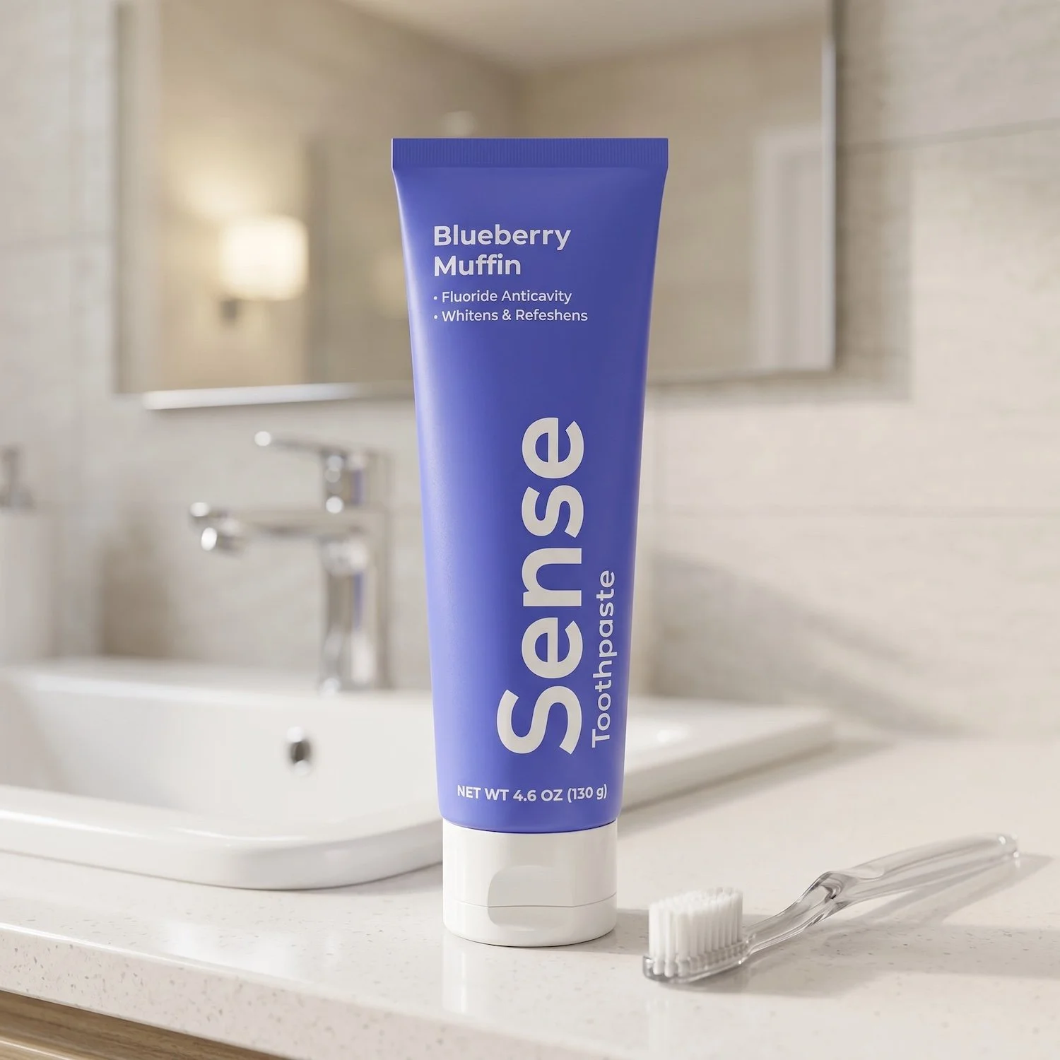
Sense is a health and beauty brand built around a simple idea: everyday essentials should feel intentional, enjoyable, and sensory-driven. This project focuses specifically on the Sense Toothpaste line, where flavor becomes the core differentiator and the entry point into the brand experience.
At its foundation, the name “Sense” operates on two levels. First, under the guiding idea “It Just Makes Sense”—or more simply, “Makes Sense”—the brand reinforces clarity, function, and intuitive design. Second, it reframes how consumers engage with personal care products through the lens of the senses themselves.
In the oral care category, especially, flavor is often treated as secondary. Sense challenges that convention by positioning taste as the primary sensory experience. Each toothpaste is designed to highlight a distinct flavor profile that actively engages the user, transforming brushing from a routine task into a moment of anticipation and enjoyment. The goal is simple: create toothpaste that people actually look forward to using.
Brand Idea & Positioning
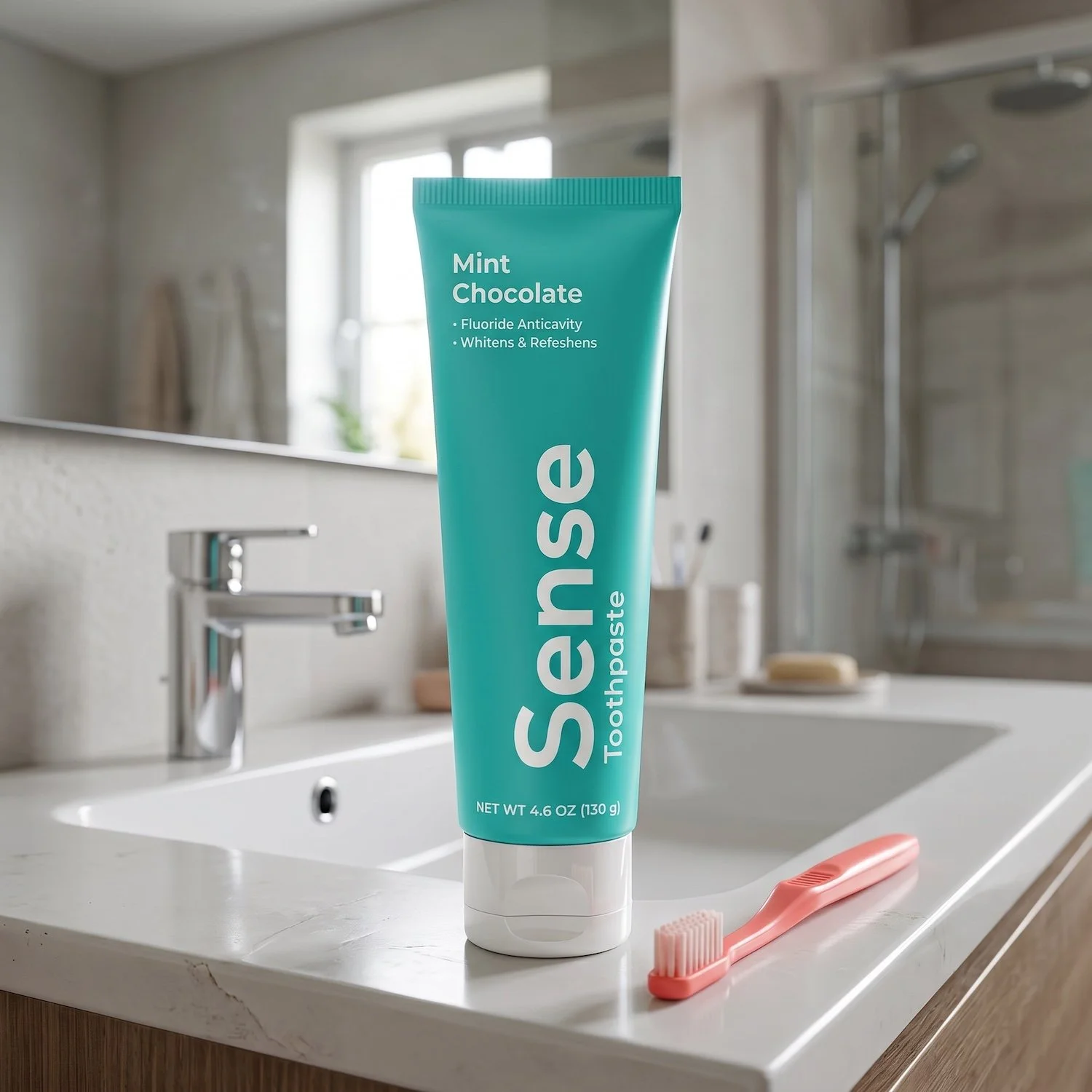
The concept behind Sense Toothpaste is rooted in a gap in the current market—an overreliance on a single flavor profile, typically mint, regardless of personal preference or context.
Sense introduces variety, relevance, and emotional connection through flavor.
Rather than treating toothpaste as neutral or utilitarian, each product is designed to “excite the senses.” Flavor becomes both functional and expressive—something that can complement or contrast with daily experiences, such as meals, routines, and moods.
This approach reframes oral care as a sensory system rather than a fixed formula, opening the door for personalization, discovery, and play.
Design Strategy
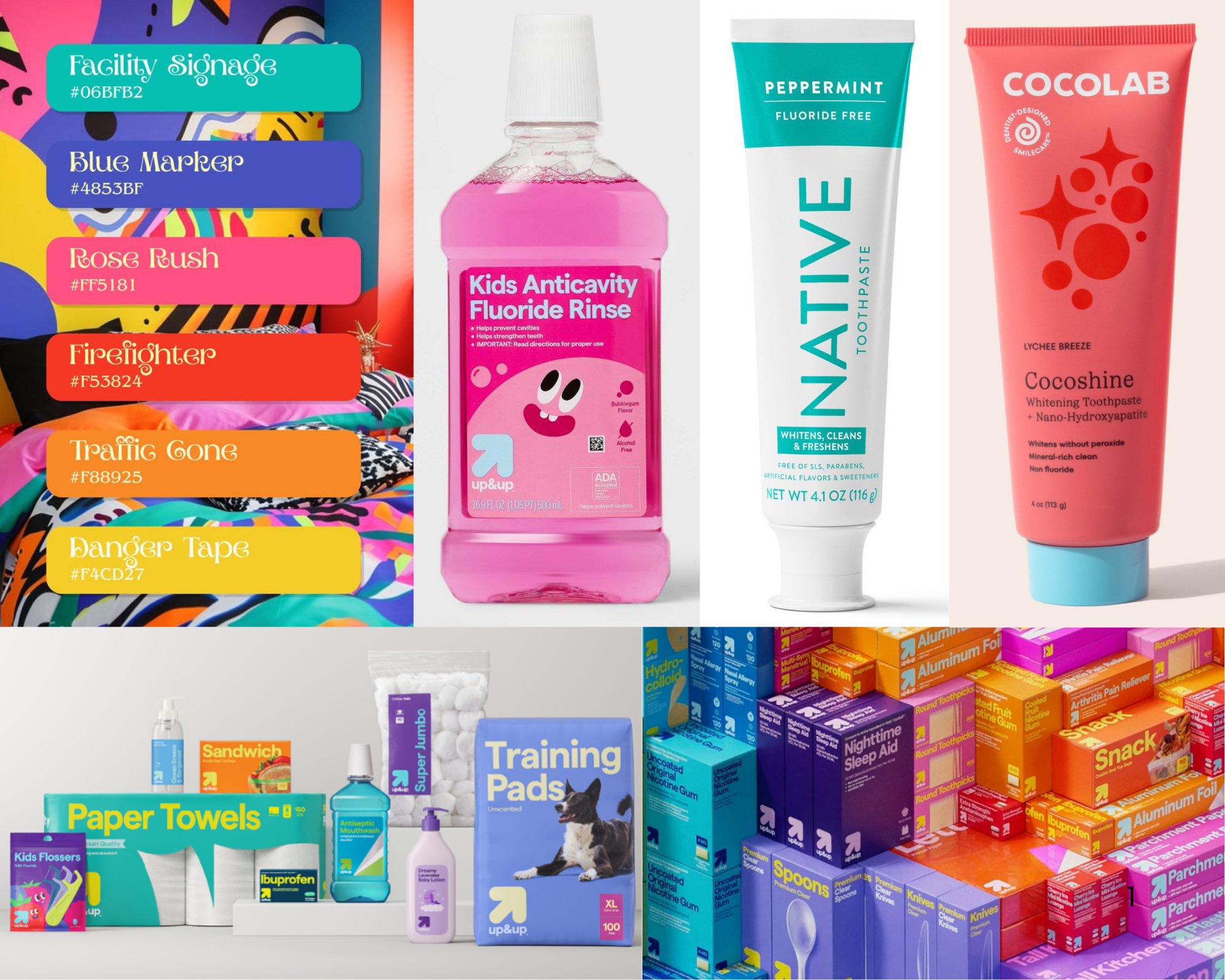
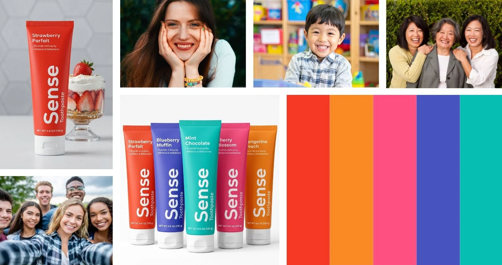
Moodboard and packaging references for the Sense design strategy focused on readability, shelf presence, and modern wellness branding.
A core principle of the design system is accessibility across all abilities. The goal is to ensure that recognition, usability, and navigation are immediate and inclusive.
Key accessibility considerations include:
Color-coded system for rapid product identification
High-contrast white typography against saturated backgrounds for maximum readability
Simple sans-serif typeface (Nexa) used throughout for clarity and legibility
Information hierarchy structured by importance, prioritizing flavor recognition first
The physical packaging also supports ease of use. An enlarged base cap improves grip and stability, while a flip-top mechanism replaces a traditional twist cap for faster, more intuitive access—especially beneficial for users with limited dexterity.
Color & Flavor System
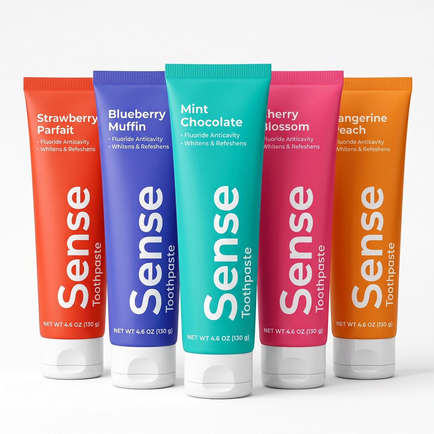
Color plays a critical role in both navigation and emotional response. Each flavor is assigned a bold, distinct color that directly correlates with its taste profile, enabling immediate recognition on shelf and intuitive product selection.
The palette is intentionally vibrant and saturated, designed to stand out in a clinical category while maintaining strong contrast with white typography for optimal legibility.
Flavor lineup includes:
Strawberry Parfait (Red) — nostalgic, creamy sweetness with a familiar comfort
Blueberry Muffin (Blue) — warm bakery-inspired flavor with a soft, indulgent profile
Mint Chocolate (Teal) — refreshing with a dessert-like twist, balancing cool and sweet
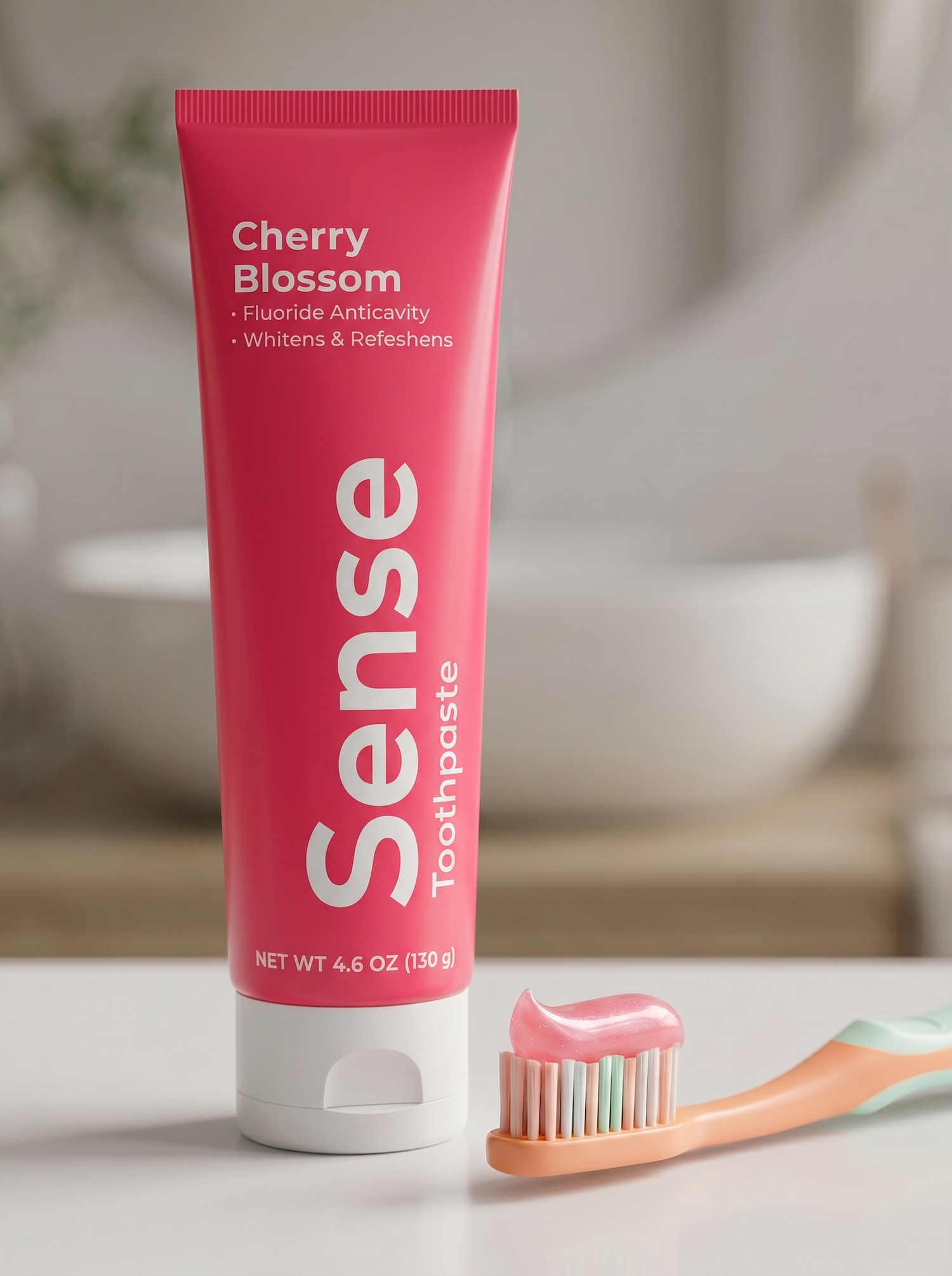
Cherry Blossom (Pink) — floral, delicate, and expressive; an exploratory flavor experience
Tangerine Peach (Orange) — bright, citrus-forward, and energizing
Each flavor is designed to connect with everyday experiences—particularly food—so brushing no longer conflicts with what you’ve just eaten, but instead complements it. A toothpaste that pairs with your day, rather than resets it.
User Experience & Accessibility

A core principle of the design system is accessibility across all abilities. The goal is to ensure that recognition, usability, and navigation are immediate and inclusive.
Key accessibility considerations include:
Color-coded system for rapid product identification
High-contrast white typography against saturated backgrounds for maximum readability
Simple sans-serif typeface (Nexa) used throughout for clarity and legibility
Information hierarchy structured by importance, prioritizing flavor recognition first
The physical packaging also supports ease of use. An enlarged base cap improves grip and stability, while a flip-top mechanism replaces a traditional twist cap for faster, more intuitive access—especially beneficial for users with limited dexterity.
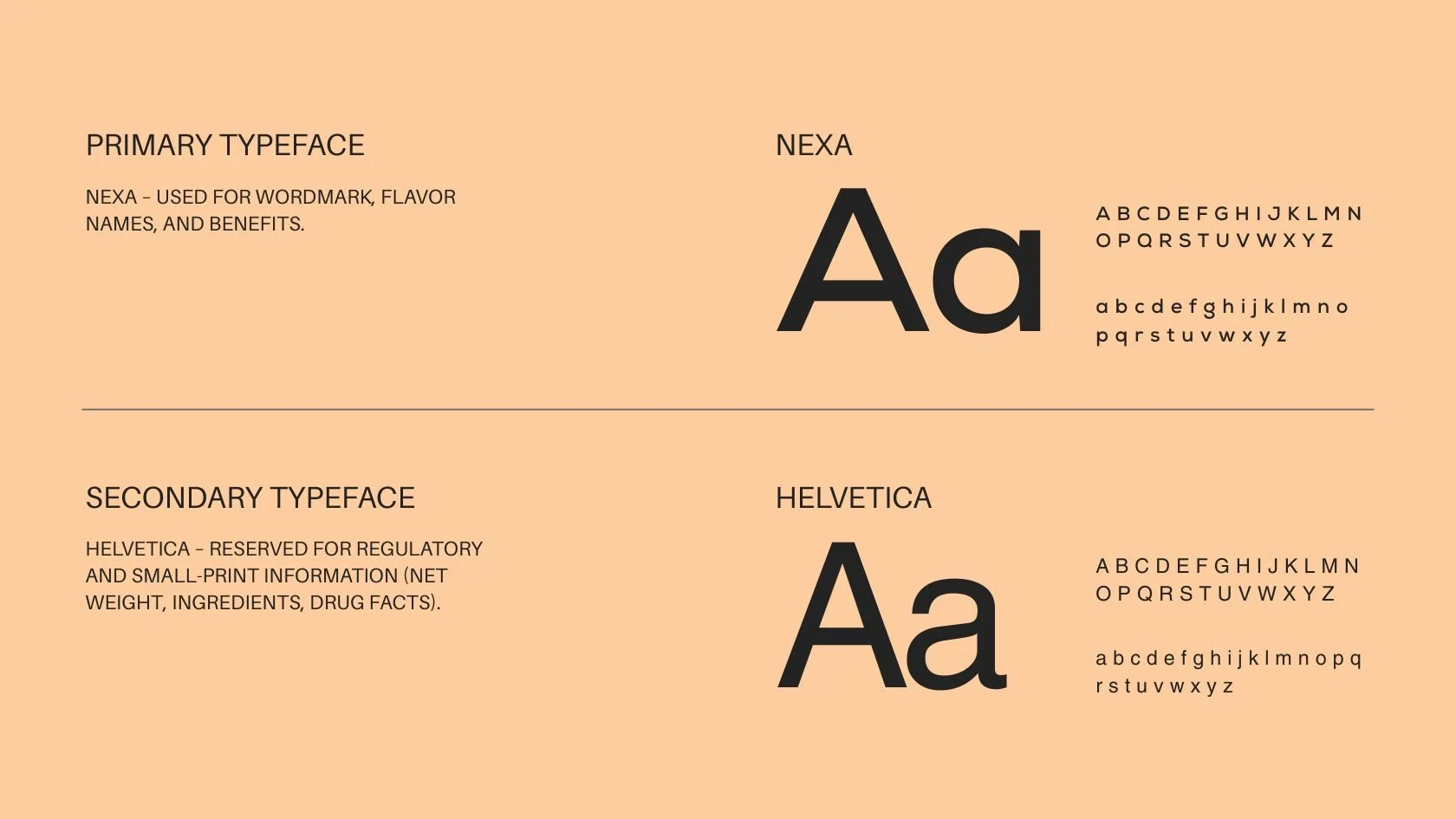
Typography & Brand System
The Sense brand system is built around a single word-mark: Sense.
This typographic approach reinforces immediacy and recognition while eliminating unnecessary complexity. Supporting product descriptors sit beneath the mark to clarify category (e.g., toothpaste), maintaining consistency across all extensions.
Primary typeface: Nexa
Exception: regulatory information (e.g., net weight) set in Helvetica
All brand text is consistently white to maintain cohesion and contrast across variable color backgrounds
The absence of additional brand colors reinforces the idea that flavor—not branding decoration—is the primary differentiator.
Flavor Experience & Brand Voice
Sense Toothpaste is designed to reintroduce enjoyment into a category that has become overly standardized.
Instead of defaulting to mint as a universal solution, this system embraces flavor diversity and emotional association. Each variant creates a moment tied to memory, mood, or imagination:
Strawberry Parfait becomes a nostalgic dessert experience.
Blueberry Muffin feels like a warm morning ritual.
Mint Chocolate turns brushing into a cool, indulgent finish to the day.
Tangerine Peach brings brightness and energy to routine care.
Cherry Blossom invites exploration—an expressive, sensory departure inspired by seasonal beauty and cultural experience.
The Cherry Blossom variant, in particular, is designed as an invitation to exploration—like taking a sensory trip through the fleeting beauty of Japan’s Hanami season, experienced entirely through taste.
Rather than limiting users to one sensory baseline, Sense encourages curiosity, rotation, and discovery—turning daily care into something experiential.
Concept Overview
Sense Toothpaste is ultimately about rethinking what everyday care can feel like. It transforms a functional object into a sensory system—one that is intuitive, inclusive, and emotionally engaging.
This is only the beginning. The flavor system introduced here is a foundation for a much larger ecosystem of sensory-driven personal care experiences yet to be explored.